Image Rating Screen Guide
Examples
When to Use It
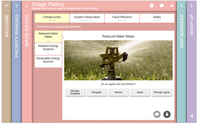
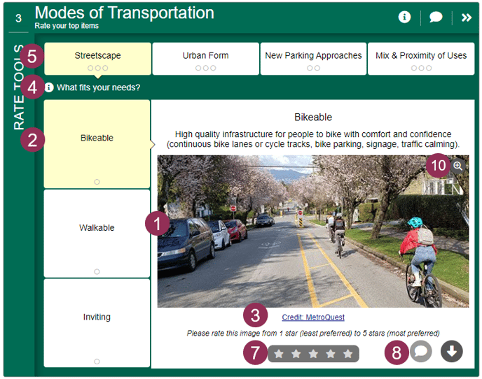
The Image Rating Screen allows visitors to vote on a series of ideas or concepts, as presented by images, one at a time. It is typically used to collect input on designs or other visual information such as options or concepts, particularly on landscape architecture and/or urban design projects.
- It provides a fast and visual way for visitors to provide input on designs, concepts or options.
- This Screen works well in early Phases of projects when community preferences are collected, or in later Phases when input on design options is sought.
- Visitors will be presented with between 2 to 64 images, grouped into between 2 to 8 categories, with between 1 to 8 items per category.
- Visitors can provide optional comments about each image.
- For comparing comprehensive plan options, the Scenario Rating Screen might be more appropriate.
- If visitors should choose between image-based choices, consider the Visual Preference Screen.

How to Build It
This Screen can contain between 2 to 64 images, grouped into 2 to 8 categories.
Content you'll need to prepare:
- Up to 64 images
- A unique label for each image
- An optional credit or each image
- An optional popup description for each category of images
Decisions you'll need to make:
- Organize your images into categories with a minimum of one and a maximum of eight images per category
- Whether or not the order of categories is tied to Priority Ranking, in which case you will need to generate content for up to 12 categories and up to 96 images
- Whether you want 5-star rating, thumbs up/down, 5-button agree/disagree, 5-button like/dislike, or custom input
- Whether or not to allow optional comments
- Whether or not to include an optional popup description for each category
- Whether or not to allow image zoom

Keys To Success
- Avoid complexity and allow participants to provide their input efficiently by presenting images that are clear and do not require too much additional explanation.
- Use this Screen to get input on plan components or sub-topics.
- Panel groupings can be used to get feedback on alternatives. For instance, 5 images within a panel could be different designs for a transit station.
- Limit the amount of text included with each image, as the text may not render well on mobile devices.