📈Interactive Reports📈
Your Priorities: An overview of all priorities that can be viewed in three different types of graphs.
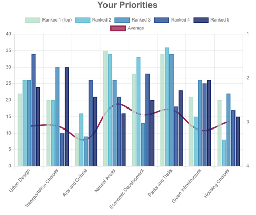
Distribution: A double axis graph. On the left axis is the number of times each priority is ranked in each position, marked by blue bars. On the right axis is the average ranking of each priority, marked by plotted points forming a red line. Individual distribution is also available for each priority.
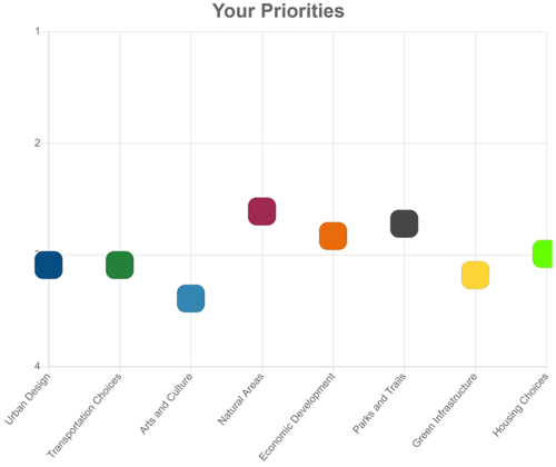
Average: A scatter point graph displaying the average ranking on each priority with a single point.
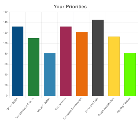
Responses: A bar graph displaying the total times each priority was ranked at any level.
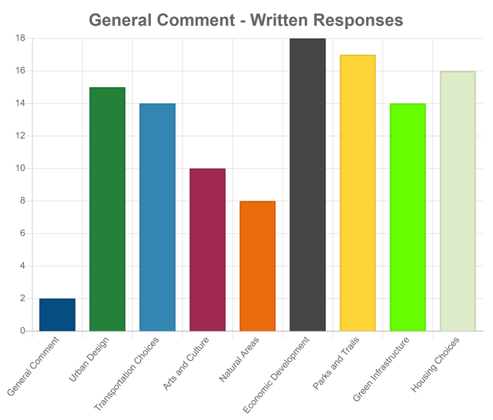
Comments: Bar graph displaying the number of individual comments on each priority, in addition to the number of general screen comments. This is just numerical data; the actual words are displayed in the excel downloads.
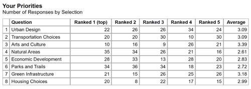
Lastly, a table view is also accessible by clicking the grid icon to the right of the dropdown.
⬇️Excel Downloads⬇️
These are spreadsheets containing numerical Data. You can download onto your computer for analysis.
- All Rankings Bar Chart
-
- Table showing the average ranking and number of times each priority is ranked
- Pre-made bar graph displaying times ranked and line graph displaying average ranking based on data from the table
- Ranking Summary
-
- Table displaying the number of times each priority was ranked in each position for both the mobile and web versions of the site
- All Rankings
-
- Table showing the individual rankings of each participant. This includes their visitor ID, the platform used, and age demographic question range.
- Comments
-
- Shows all comments submitted, including the visitor ID, visit time, the platform used, and which priority the comment was made on.