📈Interactive Reports📈
Vertical Title - Distribution: Bar graph displaying the number of times a decision was made on each project (Either “Yes” or “No” chosen)
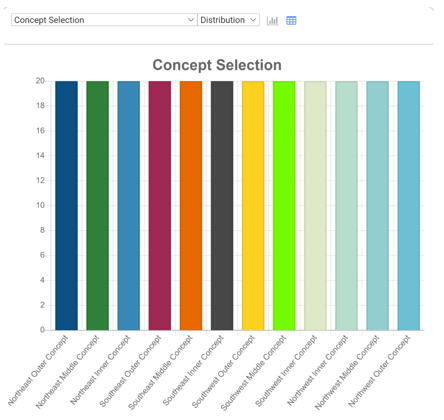
Each project on the screen has its own Dropdown.
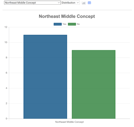
Project Title : Bar graph displaying the number of times “Yes” or “No” was chosen for each project
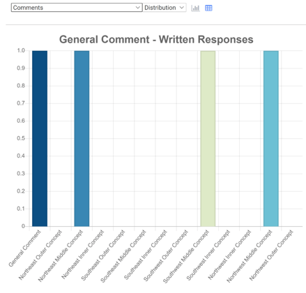
Comments: Bar graph displaying the number of individual comments on each scenario, in addition to the number of general screen comments. This is just numerical data; the actual comments are displayed in the excel downloads.
⬇️Excel Downloads⬇️
These are spreadsheets containing numerical Data. You can download onto your computer for analysis.
- All Ratings Bar Chart
-
- Table displaying the number of times “Yes” or “No” was selected for each project. A bar graph is generated from these numerical results.
- Ratings Summary
-
- Table displaying the number of times “Yes” or “No” was selected for each project. This separates mobile and web version data.
- All Ratings
-
- Table displaying every individual data point for this screen. This includes information including VisitID, visit time, platform used, and the selection (Yes or No) of the project in question, along with the answers to the Demographic questions of the Survey’s Wrap-Up screen.
- Comments
-
- Table displaying all general screen comments. This includes VisitID, visit time, platform used, and the actual screen comment.