📈Interactive Reports📈
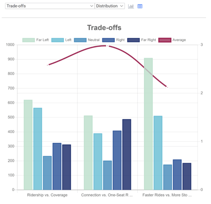
Vertical Title - Distribution: A double axis graph. On the left axis is the number of times each tradeoff is rated in each position, marked by blue bars. On the right axis is the average rating of each tradeoff, marked by plotted points forming a red line. In this case, 1 represents the far left, 3 is neutral, and 5 represents the far right.
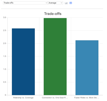
Vertical Title – Average: Bar graph displaying the average rating of each tradeoff
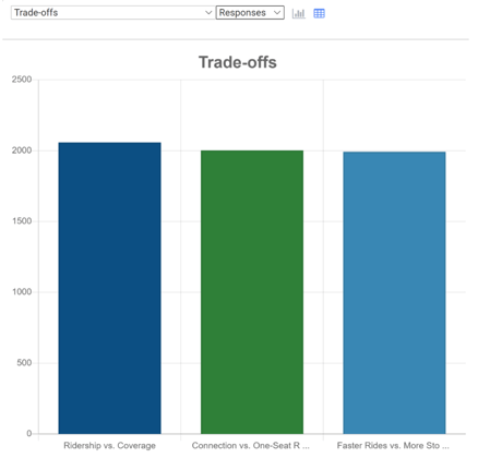
Vertical Title – Responses: Bar graph displaying the number of times each tradeoff was rated.
Each tradeoff tab on the screen has its own Dropdown.
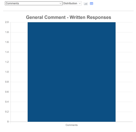
Comments: Bar graph displaying the number of individual comments on each scenario, in addition to the number of general screen comments. This is just numerical data; the actual comments are displayed in the excel downloads.
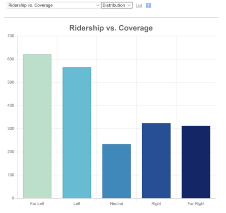
 Left Tradeoff vs Right Tradeoff – Bar graph displaying the number of times the tradeoff was rated at each position.
⬇️Excel Downloads⬇️
These are spreadsheets containing numerical Data. You can download onto your computer for analysis.
- All Ratings Bar Chart
-
- Table displaying the number of times each tradeoff was rated at each position, from Far Left to Far Right. A bar graph is generated from these numerical results.
- Ratings Summary
-
- Table displaying the number of times each tradeoff was rated at each position, from Far Left to Far Right. This separates mobile and web version data.
- All Ratings
-
- Table displaying every individual data point for this screen. This includes information including VisitID, visit time, platform used, the rating of the tradeoff in question, along with the answers to the Demographic questions of the Survey’s Wrap-Up screen.
- Comments
-
- Table displaying all general screen comments. This includes VisitID, visit time, platform used, and the actual screen comment.