📈Interactive Reports📈
Vertical Title - Distribution: Bar graph displaying the number of times a preference was selected from each set of images.
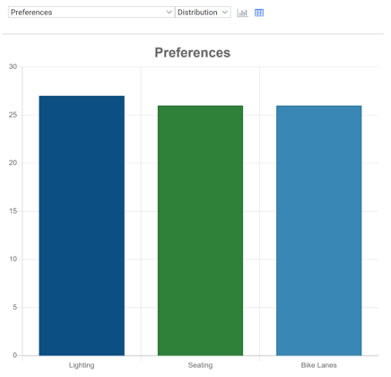
Each set of images on the screen has its own Dropdown.
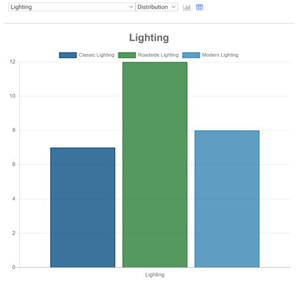
Tab Title: Bar graph displaying the number of times each image from this set was selected
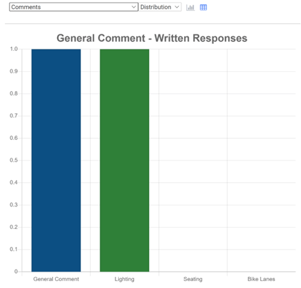
Comments: Bar graph displaying the number of individual comments on each scenario, in addition to the number of general screen comments. This is just numerical data; the actual comments are displayed in the excel downloads.
⬇️Excel Downloads⬇️
These are spreadsheets containing numerical Data. You can download onto your computer for analysis.
- Survey Data Charts
-
- Table displaying the number of times each image was selected. A pie chart for each image set is generated from these numerical results.
- All Categories
-
- Table displaying every individual data point for this screen. This includes information including VisitID, visit time, platform used, the image set in question, and image selected. It also includes the answers to the Demographic questions of the Survey’s Wrap-Up screen.
- Comments
-
- Table displaying all comments, including comments on image sets and general screen comments. This includes VisitID, visit time, platform used, and the actual comment.