Welcome Screen Guide
Examples
When to Use It
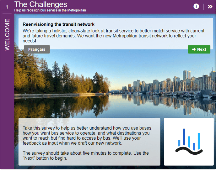
The initial screen, known as the Welcome Screen, serves as the project's first point of contact. Its purpose is to provide a brief overview of the project's context and motivate visitors to engage by presenting a clear call to action.
- The Welcome Screen is always the first Screen.
- It should be a visually appealing Screen with room for a bit of background and a call to action.
- If there is an alternate language, normally, there is a link here.
- Remember that your visitors will normally be arriving at your MetroQuest Survey from a project site.
- The Wrap-Up Screen is the only other required Screen, and it is always the last Screen.

How to Build It
Content you'll need to prepare:
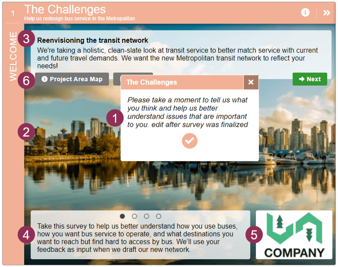
- A short paragraph that appears when the Survey is loading
- A large background image for both web and mobile
- An introductory paragraph
- Up to 8 rotating slides of text
- An optional logo
- An optional popup box, typically to show a map of the region
Decisions you'll need to make:
- How many rotating slides there are
- Whether you want a popup for extra information
- Whether you want to display a logo

Keys To Success
- Keep the introduction as short as possible. It is important that visitors can move on to the next Screen quickly. Remember that visitors are likely coming from a project site (highly recommended). More detailed context should be provided there.
- Choose a visually appealing and relevant image as your background. First impressions matter! If an image that is wider than needed is provided, it can slide behind the content when the slides move, which creates an eye-catching user experience.
- To keep visitors focused and ensure that they don’t leave the Site before they provide input, do not include any links on this Screen or any other Screens apart from the Wrap Up Screen.
- Be sure to note that the mobile version requires a separate background image.